I am cautiously optimistic, but I do like their plan for modifying the story based on the venue. Maybe we’ll get some new songs out of it.
“Before the recession started, when ‘Rent’ was closing, we thought it would fun to do the show at the Nederlander, using whatever remained of the ‘Rent’ set,” says Mitchell. “Hedwig is a hermit crab. Wherever we end up, we’ll adapt the design of the show to the theater.”
Like many of my fellow geeks, I broke down and ordered an iPad. I ended up going with the wifi version and not just because I can get it faster. Primarily, it comes down to when I use 3G data.
I have wifi at work and wifi at home. Most hotels I visit have wifi. Most conferences I attend have it, even if it’s oftentimes slow. The only time I regularly use 3G is in a car and when I’m about town. I’m pretty confident I won’t be pulling out my iPad on the street corner while I’m looking for a nearby dry cleaners. I might miss having it in the car (big maps and GPS is tempting), but I came to a seemingly obvious conclusion: I have an iPhone.
My guess is that 70-80% of the first round of iPad buyers also have an iPhone and 90+% have a 3G-capable smartphone. In many cases, the iPhone is capable of what we need and is oftentimes better suited. The smaller form factor is more discreet and makes it much easier to fit in your pocket. People don’t pull out their laptops at dinner when they’re looking for a delicious ice cream spot, but they definitely pull out their Blackberry or iPhone.
Paul Lamere comes up with some great lists Amazon could create with data about reading status in Kindle. Some examples:
Most Abandoned - the books and/or authors that are most frequently left unfinished. What book is the most abandoned book of all time?
Read Speed - which books/authors/genres have the lowest word-per-minute average reading rate? Do readers of Glenn Beck read faster or slower than readers of Jon Stewart?
For years, I’ve seen a large chunk of my friends going to SXSW Interactive every year. I’ve also seen a handful of others claim it hasn’t been good for years (“It’s too big!”, etc.). A week (or so) removed from my first trip to SXSWi, I’m still reeling a bit. My enjoyment seems to indicate that SXSW has worked through its growing pains, primarily aided by technology.
With that, here are my tips for having a good time at SXSW.
Before leaving, make note of all of the talks that sound interesting. I recommend the utterly fantastic app by Weightshift, sitby.us. Not only does it let you create a schedule, but you can see what your Twitter friends have noted. Then (yes, it gets better), you can see where they are in the room after they sit down. This let me find my friends throughout the day.
Avoid panels and go for talks with one or two presenters. While I saw some good panels, I found they were typically less inspiring. My theory is that people feel less of a need to prepare for panels.
Go to talks that sound fun and interesting. Don’t worry about going to CMS talks if you work for a blog software company. Many of the talks are topical and you’re better off following the “Liberal Arts” approach of selecting sessions. My two favorite talks were given by Dan Ariely and Andy Baio. Neither seemed geared towards my job, until I got there and realized they were far more influential than the other talks I attended.
Get used to finding people via Foursquare (or your location-based service of choice) and Twitter. At night, I had no problem finding something fun to do with people I like.
Avoid the big parties. As many as 14,000 people went to SXSWi and I’d guess half of them tried to get into the Foursquare party. Smaller parties are great (I really enjoyed the Typekit party) and hanging with friends is even better. If you don’t know many people there, get a drink at the Ginger Man. You’ll likely meet someone cool and you’ll definitely have delicious beer.
Get away from the convention center. I stayed at a friend’s place, which meant finding a place to unwind during the day was tough, but it also meant I found a delicious breakfast tacos at Julio’s in Hyde Park. I also skipped the 2pm session most days and walked a bit to find lunch. This was a great way to clear my head and try Chicken Fried Avocado.
Don’t plan too much. It will save you time before and stress when you arrive.
Following up on Anil’s post, Life on the List comes HARD DATA showing that having a lot of followers doesn’t tell us much about influence. From the abstract:
We make several interesting observations. First, popular users who have high indegree are not necessarily influential in terms of spawning retweets or mentions. Second, most influential users can hold significant influence over a variety of topics. Third, influence is not gained spontaneously or accidentally, but through concerted effort such as limiting tweets to a single topic.
The Secret Cycle (Sorry, the full article is subscriber-only) is a New Yorker article about a market analyst named Martin Armstrong who built his theories on the concept of cycles, specifically around the number π. The gist is that every 8.6 years (some connection to π) there is a major market event. These events are not always noticeable when they happen, but after the fact it became clear that something did occur.
Armstrong, in his essay “Understanding the Real Economy,” said “I have spent a lot of time trying to comprehend how such a model can even work on a specific level to a precise day, years and decades in advance. The only explanation is the subject matter is so intensely complex that there is indeed a hidden order within what would appear to be random chaos.”
…[Analyst Bill Erman] noted that termites build their perfect mounds, and bees their perfect hives, and spiders their perfect webs, all around the world, without, presumably, being conscious of why or what they are doing. “Mankind is unconsciously constructing a geometrically perfect market,” Erman said. We can’t help building our own beehives in the air. The charts are our termite mounds.
Much to my shagrin, Netflix is planning to phase out the Friends component of their service. I’m okay with the now defunct community tab, but I base many of my rentals my friends’ ratings. As evidenced by no one team reaching the full 10% improvement in the Netflix Prize, we’re not close to computer-based recommendations being better than my friends. To sum up: I’m on Team Friends.
On the way over to SXSW, I was reading The Invention of Air by Steven Johnson. It’s good, but my mind was obviously in a design mode, not a science mode. So when I crossed this sentence, it leaped out.
We accept the premise that organisms have comparable purposes in the systems that collectively keep them at homeostatic norms: our bodies stay marvelously calibrated at 98.6 degrees for a reason, and that reason is that our particular mode of staying alive is optimized for that temperature. That is one of the defining characteristics of what it means to be an organism: a system of cells and organs that are explicitly devoted to ensuring the survival of the larger group to which they belong. [Emphasis is mine]
That last line is sticking with me. Whenever I want to make a change or an addition to a site, I have to think about how it will affect every other aspect of the system and what needs to be adjusted. The site needs to always hum along at 98.6 degrees.
It’s also going to encourage me to build more elastic solutions. Instead of creating a system that fails completely when something goes wrong, have it work well enough, but — just as your body’s temperature rises when you’re fighting an infection — send you warning signs that trouble is brewing. For example, forms should submit data even if it’s incomplete, because people might not try again if they’re overly frustrated.
As for SXSW, I’m still mulling things over. Expect some posts over the next few days.
As discussed, I gave a talk last night about The Tablet. Thanks very much to Liz for organizing the event. When I began planning my talk, I found it was easier to write it out as a blog post so I could find the narrative. I did just that.
What follows is the blog post and some of the imagery attached. At the very end, I included my slides from the talk, which have some additional imagery. (If you’re more of a visual person, skip to my slides on Slideshare.)
Up until now, we’ve done most of our reading using a single layer of data. This works well when you have abundant space, but breaks down when you try to work on a smaller device. As we pack more and more data into smaller spaces, we need to consider how this data is presented. The answer that provides the best compromise of accessibility and usability is to layer our data using modal dialogs. And now, a story.
During college, I oftentimes bought my textbooks used, primarily because they were cheaper. The cheapest books were thoroughly marked up, with notes in the margins and important phrases highlighted. Sometimes, it was great to already have the important bits noted for me, but most of the time I just wanted to read. My wish was to be able to remove that layer of data only temporarily. Little did I know that 10 years later, that would be possible.
When data is presenting it a single layer, ancillary data exists separately from the primary text. When you’re studying, you write down the important parts in a notepad and create study tools with flash cards. When you’re watching a film, the credits appear at the end of the film and the deleted scenes are accessed in another menu entirely. When you’re reading a novel, contextual content is often in appendices and definitions are, well, in your dictionary.
The iPhone and other smartphones have improved the situation. Instead of having to make a note during a movie or keep your finger on the current page while flipping to the appendix, you can pull out your phone (or laptop or whatever) and look up the information. Of course, that is still two information sources in the same plane.
It’s also gotten a lot easier on the web. Sites like the New York Times offer the ability to double-click a word and get the definition. Flickr lets you annotate photos with text. The Definitive Guide to Django provides an online version of the book that lets you comment on each paragraph. As the ultimate example, Google lets you overlay a variety of information on top of a map.
Since we still do most of our reading on paper, we’ve been stuck with just a single layer of data. The best we’ve got are footnotes and notes in the margin. The introduction of the Kindle has provided a suitable replacement for reading devices. Having 1,000s of books in your hand is wonderful, but the Kindle only provides two layers of data: text and definitions. And without a touch screen, trying to get a definition is tough. You have to navigate to the word with the thumb nubbin before the definition pops up. It takes you out of the flow of reading a lot more than clicking a mouse or tapping the word.
How This Would Work
Bringing the multitouch interface to such a large surface area will allow us to bring far more layers of data to a document. Let’s come back to our studying example. My wife is taking an Anatomy & Physiology class and has a test coming up. She has out her text book, flash cards, a notebook and a reading guide. While going over her notes, she might want to refer back to the source text for some additional information. She has to find the right page, then find the right paragraph and look for context.
Now, let’s say Apple or some inventive fellow builds an iPad application meant for studying. You can download your textbook and, as you read, tap on a paragraph to open up a modal dialog for taking notes. Or maybe you just select some text and copy the text into your notebook. Next time you go through the book, you’ll see a little speech bubble, like the Django book example, alongside the text. When it’s time to study, click the ‘View notes’ button and you’ll see a version of just the text you’ve highlighted and your notes. Back to the book. If something you’re reading is confusing, selecting text could let you define or Google it. If that doesn’t pan out, you can add a public note. Your friends in the class would be notified and can answer your question. The answer will show up in context. Taking the social element further, being able to view your study partner’s notes overlaid on your page could answer questions you didn’t know you had.
Below are some design explorations I put together to illustrate the example.
These types of interaction could be carried over to a work of literature. If you’re in a book club, the reading questions could come be visible at relevant point. You could make notes in the margin that the rest of your book club could see. There’s also an opportunity for authors to provide something like a director’s commentary. When you find out SPOILER ALERT that Bella choses Edward over Jacob, Stephenie Meyer could put in a note explaining that it took her months to make this decision and it was only after talking to a bellhop at the Paris in Las Vegas that she made her decision. Or, possibly more interesting to some of you, how Malcolm Gladwell did his research about Hush Puppies.
As a final example, adding a touch interface to films, means one of my personal dreams can be fulfilled. When you want to know more about an actor, pause the movie and tap his face. Using iPhoto’s facial recognition software and a partnership with iMDB, the actor’s name and his last 5 films will pop up in a modal dialog. They’ll also be a link to any relevant extras that include that actor.
What We’ve Learned
There is nothing wrong with the old way of studying or reading, so long as you have all of your information around you. The challenge of bringing a comparable or better experience to the iPad is finding a way to improve portability without sacrificing accessibility.
Using modal dialogues and layering data lets you display ancillary content without taking away from the source text. Since that’s why people are coming to your content, that should have the focus. Providing the rest of the data should be seamless, but natural. Finding that balance will lead to an engaging (and hopefully unforgettable) experience.
Presentation Slides
Update (4/2/10): Video!
SVA has kindly posted a video of my talk online. Please enjoy, if you prefer moving pictures:
I’d heard about this for a while, but it’s quite a treat. You should absolutely read the whole thing, but this was my favorite excerpt.
Exploratory learning can be engineered into repeatable systems: Moments of delight and skill acquisition are highly reproducible. All you need is a well designed and balanced system of interconnected feedback loops that helps guide and encourage the formation of new skills.
OMG. Available 3/16. Extra bonus: “Additionally, a special version of Lady Gaga’s ‘Poker Face,’ made famous by South Park’s Eric Cartman, will also be available…” [via @Remy]
To keep on top of their various projects, Panic installed an LCD screen with an overview of what’s going on. I’ve wanted to do this at home for the longest time.
Our support turnaround time is faster than it’s ever been. Just the simple act of “publicizing” those numbers — not in a cruel way, but a “where are we at as a group?” way — has kept the support process on-task and, I think, made it a bit more like a video game. (It helps that when all the boxes are at “zero”, a virtual bottle of champagne appears on-screen, and a physical one is likely removed from the fridge.)
This Wednesday, March 10th, I’ll be speaking as a part of SVA’s Dot Dot Dot lecture series. The talk is all about “The Tablet”. There will be several very smart people talking including Khoi Vinh and I’m very excited to be a part of it. You can learn more and RSVP here. The important bits:
Wednesday, March 10th: 6:30-8:30pm
Galapagos Art Space in Brooklyn (Map) RSVP
SXSW
I’ll be making my first voyage to SXSW this year. I’m not speaking, just planning on having a damn good time. If you’re curious, these are the events I’m considering attending. If you have any suggestions for events or delicious eateries, I’m all ears.
I wish there was a cable channel with five minute snippets of experts doing things. In the meantime, you’ll have to suffer through this flash interface showing several others. My second favorite is the boot shining. [via Put This On]
In the end, it will turn out to be something simple. I probably called the Bankcard Merchant Services department instead of the Merchant Services Bankcard department, and they can only see certain types of accounts, or some such thing. I don’t think my money actually disappeared. The real problem is that the world has become so complex that simple tasks are nearly impossible.
“Crumpled City Maps are soft, yet hard-wearing, waterproof and meant to be creased and crumpled. You can place the area that you’re interested in on the palm of your hand to spot street names then just screw it up, stuff it back into its case or your pocket, and carry on.” via Information Aesthetics
My coworker/buddy Mark Paschal built the most funnest website. Login, take a photo with your webcam, it appears automagically. It’s like the internet’s photo booth.
A couple of weeks ago, Frank Chimero announced a refresh of a site he helped build called Thinking for a Living. The site is beautifully designed and includes a novel and intuitive navigation system. In place of using your mouse, you can control nearly every aspect of the site via the keyboard. Seeing this and using Gmail keyboard shortcuts for years made me wonder why we don’t have a standardized way to access a blog via keyboard shortcuts.
Inspired by these examples, I’ve begun a new project to develop a set of standard keyboard shortcuts for your blog. I’m calling it Blog Shortcuts (try not to be blown away by my creative naming). Before I get to my plans for developing and releasing it, you should give it a whirl. I’ll explain each of the shortcuts, but if you press ? right now, you’ll see all of the options available to you.
Available Shortcuts
I tried to pick out shortcuts that would apply to any blog, but this first set are tailored to my site. You can navigate up and down a list of entries, like The Big Picture and access sections of the site via particular keys (e.g., H for home). My favorite feature is the ability to load a particular tag by pressing g+t. Here is the full list:
Scroll to the next entry: n or j
Scroll to the previous entry: p or k
Load the newer entry on permalink: N or J
Load the older entry on permalink: P or K
Go to the homepage: H
Go to reviews: r
Go to archives: A
Go to about: a
Focus on search: s
Go to top: t
Show the tag input window: g+t
See all available shortcuts: ?
Development and Release
The project is currently up on Github, but is obviously in its infancy. I’ve outlined a set of to-dos in the README file that I hope to tackle over the coming weeks. If you want to get it running today, feel free to download the v0.1 release and play with the Javascript. If you would like to help out in any way — cleaning up my messy Javascript, offering opinions on shortcut keys — I’d love to collaborate.
Update (3/3/10): Found a bug in FF 3.5.x and wanted to add some basic styles, so we’re already up to v0.2. Progress!
I just purchased Heavy Rain for my PS3. It’s been getting fantastic reviews, but I’ll talk more about the gameplay after I make some more progress.
In order to play the game, you need to copy a multiple-gigabyte-sized installaition package to your PS3’s hard drive. It takes about 15 minutes. Quantic Dream, the game’s developers, obviously knew this, so they included a graphical sheet of paper with the game and displayed instructions for building the origami figure featured prominently in the game.
When people talk about user experience, this is the kind of thing I like to bring up. Quantic Dream knew you couldn’t do anything else and you’d likely be annoyed at the wait, so they gave you a fun task to while away the time. Before I even played the game, I loved it.
For long emails, you’d write a brief abstract that would go at the top. It would also be a great way to see if you can say in 200 characters what you tried to say in 2,000.
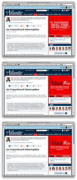
One of the tenets of the GTD philosophy is pushing anything you can’t do in a couple minutes into a queue. It’s one of the few pieces of advice that’s really stuck with me. As a result, I’ve grown accustomed to estimating an article’s length based on a quick glance.
Unfortunately, this is difficult to do without some scrolling. The easiest method is to look at the scroll bar to determine the length, but this is not reliable. There’s no way to know the number of comments or how long a sidebar might be. To the right, you can see an illustration of what I mean. The top screenshot shows the site as it is now. Below it are a version that hides comments and then sidebar items.
I have no answer, just a wish.
This is the point in the post where you would normally expect to find a wonderfully crafted solution, but I don’t have one. I’ve considered JS bookmarklets that would automagically show an indicator next to the scroll bar that marks the end of the article, but there would be a ton of edge cases. It also doesn’t handle page counts.
The best case scenario is the universal adoption of the HTML5 article element. And while I’m dreaming big, I’d love some metadata as parameters: character count, number of pages, etc. (and a coal-burning pizza oven, please).
In the end, I’ve outsourced my standardization of content and read articles via Instapaper on my iPhone. It standardizes article layout, making it easy to determine length (the scroll bar works perfectly here). If they started displaying word counts on the website, I’d squee. Thusly, I’m really looking forward to Marco’s iPad version of Instapaper. It’s going to solve all of my problems.


 For years, I’ve seen a large chunk of my friends going to SXSW Interactive every year. I’ve also seen a handful of others claim it hasn’t been good for years (“It’s too big!”, etc.). A week (or so) removed from my first trip to SXSWi, I’m still reeling a bit. My enjoyment seems to indicate that SXSW has worked through its growing pains, primarily aided by technology.