As discussed, I gave a talk last night about The Tablet. Thanks very much to Liz for organizing the event. When I began planning my talk, I found it was easier to write it out as a blog post so I could find the narrative. I did just that.
What follows is the blog post and some of the imagery attached. At the very end, I included my slides from the talk, which have some additional imagery. (If you’re more of a visual person, skip to my slides on Slideshare.)
Up until now, we’ve done most of our reading using a single layer of data. This works well when you have abundant space, but breaks down when you try to work on a smaller device. As we pack more and more data into smaller spaces, we need to consider how this data is presented. The answer that provides the best compromise of accessibility and usability is to layer our data using modal dialogs. And now, a story.
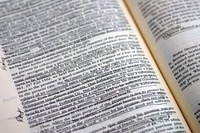
photo by nirbhao
During college, I oftentimes bought my textbooks used, primarily because they were cheaper. The cheapest books were thoroughly marked up, with notes in the margins and important phrases highlighted. Sometimes, it was great to already have the important bits noted for me, but most of the time I just wanted to read. My wish was to be able to remove that layer of data only temporarily. Little did I know that 10 years later, that would be possible.
When data is presenting it a single layer, ancillary data exists separately from the primary text. When you’re studying, you write down the important parts in a notepad and create study tools with flash cards. When you’re watching a film, the credits appear at the end of the film and the deleted scenes are accessed in another menu entirely. When you’re reading a novel, contextual content is often in appendices and definitions are, well, in your dictionary.
The iPhone and other smartphones have improved the situation. Instead of having to make a note during a movie or keep your finger on the current page while flipping to the appendix, you can pull out your phone (or laptop or whatever) and look up the information. Of course, that is still two information sources in the same plane.
It’s also gotten a lot easier on the web. Sites like the New York Times offer the ability to double-click a word and get the definition. Flickr lets you annotate photos with text. The Definitive Guide to Django provides an online version of the book that lets you comment on each paragraph. As the ultimate example, Google lets you overlay a variety of information on top of a map.
Since we still do most of our reading on paper, we’ve been stuck with just a single layer of data. The best we’ve got are footnotes and notes in the margin. The introduction of the Kindle has provided a suitable replacement for reading devices. Having 1,000s of books in your hand is wonderful, but the Kindle only provides two layers of data: text and definitions. And without a touch screen, trying to get a definition is tough. You have to navigate to the word with the thumb nubbin before the definition pops up. It takes you out of the flow of reading a lot more than clicking a mouse or tapping the word.
How This Would Work
Bringing the multitouch interface to such a large surface area will allow us to bring far more layers of data to a document. Let’s come back to our studying example. My wife is taking an Anatomy & Physiology class and has a test coming up. She has out her text book, flash cards, a notebook and a reading guide. While going over her notes, she might want to refer back to the source text for some additional information. She has to find the right page, then find the right paragraph and look for context.
Now, let’s say Apple or some inventive fellow builds an iPad application meant for studying. You can download your textbook and, as you read, tap on a paragraph to open up a modal dialog for taking notes. Or maybe you just select some text and copy the text into your notebook. Next time you go through the book, you’ll see a little speech bubble, like the Django book example, alongside the text. When it’s time to study, click the ‘View notes’ button and you’ll see a version of just the text you’ve highlighted and your notes. Back to the book. If something you’re reading is confusing, selecting text could let you define or Google it. If that doesn’t pan out, you can add a public note. Your friends in the class would be notified and can answer your question. The answer will show up in context. Taking the social element further, being able to view your study partner’s notes overlaid on your page could answer questions you didn’t know you had.
Below are some design explorations I put together to illustrate the example.
These types of interaction could be carried over to a work of literature. If you’re in a book club, the reading questions could come be visible at relevant point. You could make notes in the margin that the rest of your book club could see. There’s also an opportunity for authors to provide something like a director’s commentary. When you find out SPOILER ALERT that Bella choses Edward over Jacob, Stephenie Meyer could put in a note explaining that it took her months to make this decision and it was only after talking to a bellhop at the Paris in Las Vegas that she made her decision. Or, possibly more interesting to some of you, how Malcolm Gladwell did his research about Hush Puppies.
As a final example, adding a touch interface to films, means one of my personal dreams can be fulfilled. When you want to know more about an actor, pause the movie and tap his face. Using iPhoto’s facial recognition software and a partnership with iMDB, the actor’s name and his last 5 films will pop up in a modal dialog. They’ll also be a link to any relevant extras that include that actor.
What We’ve Learned
There is nothing wrong with the old way of studying or reading, so long as you have all of your information around you. The challenge of bringing a comparable or better experience to the iPad is finding a way to improve portability without sacrificing accessibility.
Using modal dialogues and layering data lets you display ancillary content without taking away from the source text. Since that’s why people are coming to your content, that should have the focus. Providing the rest of the data should be seamless, but natural. Finding that balance will lead to an engaging (and hopefully unforgettable) experience.
Presentation Slides
Update (4/2/10): Video!
SVA has kindly posted a video of my talk online. Please enjoy, if you prefer moving pictures:
03/11/10 4:31 PM
i would have loved to hear this talk. my number one question after reading the post and going through the slides: keynote or powerpoint???
03/11/10 4:32 PM
Keypoint! Okay, it was Keynote. So much purdier.
03/11/10 5:04 PM
Nice ideas... well presented.
03/17/10 8:52 PM
Hi Matt,
Great post! I've been spending lots of time thinking about these issues -- and in fact am halfway through writing a book called "A New Kind of Book". In it I propose several dozen ways that digital books can do things not possible in print...including a number of ideas that explore the concept of multiple layers. I gave a talk at last month's TOC conference where I presented 10 of these ideas: http://bit.ly/cYwTVT. That link has my whole preso (including my audio). Two spots in particular you might find interesting: 6 min's, 20 seconds in where I discuss a feature called "Character Notes" (brief character summaries, accessible at-a-tap, to help jiggle your memory) and 7:40, where I review what I call the "Notes & Highlight Browser" -- which addresses the problem of *reviewing* your notes & highlights after you've made them.
Best,
Pete
03/17/10 8:59 PM
WHAAAAT BELLA CHOSES EDWARS OVER JACOB!!!!!!
03/18/10 5:31 AM
Hi, the post is interesting et i agree with most of the concepts. As a software engineer, i would love to have such a device for technical documents or specification.
Anyway, i can't really see a tablet as a true replacement for book, just because reading for 30 minutes non stop on a LCD screen hurt your eyes so much.
I think one of the solution may be found with devices which integrate both LCD & E-ink screen (like this one http://gizmodo.com/5471559/notion-ink-adam-tablet-caught-on-video-specs-finalized)