Capn Design

Design

The Hulu Player Heat Map

Posted May 13, 2010

20100513hulu.jpg

Hulu is unveiling a brand new player (yes, it’s still in Flash) that has lots of awesome features, which you can read about at your leisure (here’s a cached blog post too). My favorite, by far, is the heat map.

On any full episode on the site with a sufficient volume of views, a heat map shows the relative popularity of every moment in that episode. Find hot and popular moments within long videos in no time at all.

Now I just want to see a longer version of this that covers a whole season or series.

[via Zach Klein]

What's Not to Like?

Posted December 23, 2009

There a number of gestural ways for readers to indicate interest in content on the web. They all go by different names and representations, which makes it difficult to determine the right solution for your community. Below is an examination of the available options and, hopefully, answers to all of your burning questions.

Earlier this week, I was reading Gothamist and became engulfed in an article about EMTs letting a pregnant lady die. It’s an insane story and there are a ton of comments. There are also three “likes”. This disparity—one amongst many that exist on the internet—shows that there’s something broken with “liking” content.

When you find a piece of content that excites you, you probably want to do one of these things:

  • Respond to the article with a comment of your own
  • Bookmark the article for later
  • Share the article with someone else
  • Let the author know that you enjoyed the content

When a user “likes” a piece of content, they could be doing any of the final three actions, depending on the service. In the case of Gothamist, my instinct is that people “like” content because they want to tell the author and other readers that it was interesting and that they’d like to see more like it. Assuming this, why didn’t more people “like” this entry?

Before I answer that question, it’s worth noting that these gestural responses are very different from other reactions to content. Commenting, replying, sharing and even reblogging all involve content creation, which is a higher level of engagement and worthy of its own discussion. I also won’t really touch on flagging (e.g., spam, offensive content) or ratings.

Language Matters

Gothamist, as well as another small site called Facebook, use the word “like” as a way to note enjoyment, but it’s conflicting for a person to “like” an article that’s about a pregnant lady dying. Am I saying I like the article or that I like killing pregnant women and their fetuses? It’s clearly not the best phrase here, even though it works in most contexts.

There are certainly other options. Here are the ones I’ve seen the most and what they might imply. These are illustrative examples that cover many, but certainly not all, use cases (if a service has a word and a symbol, I just mentioned the word).

Type Services Definition
Like icon Facebook, Vimeo, Google Reader As discussed, it can either mean I liked reading the content or I agree with the content. Essentially, I feel happy after reading this. It’s more often used as encouragement than as a bookmark.
Favorite icon YouTube, TypePad, Posterous Similarly, this is something I enjoyed reading, but it tends to lean more towards a bookmark.
Recommend icon Movable Type, NYT I enjoyed reading this and I think you should enjoy reading it too.
[Up/Down] icon Reddit This is essentially recommend and not recommend.
[Star] icon Twitter, Google Reader This is mostly synonymous with “favorite”, but because there are no words it’s more open to interpretation.
This is good icon Vox I’ve only seen this on Vox, but I love it so I’m including it. This is back to a happy feeling and closest to “like”.
[Heart] icon Tumblr Very similar to “This is Good”.

The interpretations may give you some insight into what is appropriate for your context. In the case of the Gothamist article, “recommend” may be the best phrase since they use this data to calculate their popular article rankings. This isn’t everyone’s goal, though.

What To Do

There’s certainly no magic bullet, but how you implement this feature should depend on what you want to get out of the data. In the end, most publishers are looking for increased page views, but the path there relies on added value for the site’s community. If you’re keeping them engaged, they’ll keep coming back, which leads us to our final list. These are the benefits of using favorites:

  • A list of popular content: In addition to comments, page views, etc., you can use this to determine what content is most read on your site. This is an example of data that the publisher parses to add extra value (as opposed to the user).
  • A measure for the success of your articles: You can use this metric to refine the type of content on your site and gauge the success of your writers. This is another example of publisher-driven data.
  • A curation tool for users: People often just want a way to bookmark content, but it’s more often used as a way to represent who you are. There are millions of Facebook users whose identity is based solely on the items they “like” and share. This is an example where the community is making use of the data.

Really, all three use cases are valuable to publishers and users, just in different ways. The first and third are most valuable to sites that rely on user-generated content and the first two are more valuable for editorially-driven content. In the end, you should focus your efforts on what will improve the quality of and access to your content, because that’s why people visit your site.

Some Additional Notes

If your site is very upfront about its purpose, the language becomes less important. For sites where the homepage is a list of most popular content (e.g., Digg, Reddit), most users will click the button with the intention of promoting content to that list.

It’s also worth mentioning that sites often have two ways to provide gestural feedback, which can cause confusion and frustration. If you look at Twitter’s new retweet functionality, the inability to add your own comment essentially turns this into another way to favorite. It may show up in your user stream instead of a separate page, but it’s the same feature. Google Reader has two gestural responses: like and star (in addition to share and share with note). It seems like they’re just throwing the kitchen sink at the problem.

Finally, there’s the issue of site-specific jargon. Digg is the only site I can think of that does this with any success. Creating a new verb is not worth the overhead I would never recommend this unless your name is Kevin Rose.

I encourage you to comment with additional use cases and examples of usage in various services. I’d love to see as many examples as possible.

You Could Eat Off the Floors

Posted November 4, 2009

This Volkswagen factory in Dresden is beautiful. The outside is almost completely glass, the floors are made of hardwood and the parts are transferred by robots that move along thousands of magnets embedded in the ground.

When the production process is a work of art, it makes the end result feel more impressive. Some companies, like Apple, focus on beautiful packaging, but it doesn't say much about the craftsmanship. Unlike the iPod, the Phaeton — the luxury car built at the Transparent Factory — is not an impulse purchase.

Seeing the care put into its creation makes dropping $75,000 (minimum) on a car an easier pill to swallow. More importantly, it makes you believe, or at least hope, that they put the same effort into producing their more affordable cars.

Stadium Franco Sensi

Posted October 17, 2009

20091016stadium.jpg

This is the proposed design for Rome's new soccer stadium. I'm not sure if I like it, but it feels like the future.

the stadium's skin is surrounded by a perimeter band and screens. through the use of advanced technology systems messages will be communicated on the exterior using the latest generation LED devices.

More pictures and more information can be found at Designboom.

Blog All Open Tabs: Clock Edition

Posted July 27, 2009

These are interesting clocks I have open right now.

Black & White Clock

20090727clocks1.jpg

"Each figure has self-contained power supply and independent control, it can be fixed to any surface autonomously. A light sensor will switch the clock to an invert mode: the figures are white in the dark time of day and black at daytime." I will buy this clock the second it is mass-produced. [via Swiss Miss]

20090727clocks2.jpg

Trace of Time

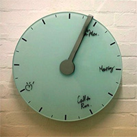
"This is a planning clock for office or studio. The Trace of Time clock not only tells the time but provides a place for users to make notes: The face of the clock is made of glass and stainless steel. Messages are erased by means of the integrated eraser. User can control speed as well for on day, one week even one month according to there schedule." Clever. [via David]

The Cleveland Indians Alternate Home Jersey is Beautiful

Posted June 15, 2009

Indians Jersey 1

Indians Jersey 2

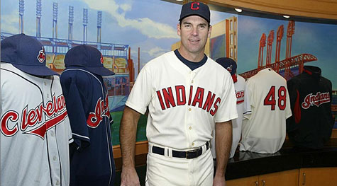
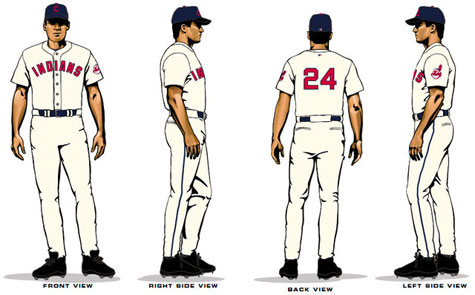
This is the second season they're wearing them, but I'm just noticing them now. Baseball uniforms are usually pretty classy, but these fauxbacks are really nice. In fact, I'm tempted to buy one of those hats, just because they look great. The only downside is the continued use of Chief Wahoo. Racism isn't cool.

If you want to see some more views, you can see the official announcement. And while they didn't really cover this explicitly, Uni Watch should satisfy any uniform curiosity you've got.

L!brary

Posted March 17, 2009

20090316library.jpg

Digging this logo by Michael Beirut, done by Pentagram for the Library Initiative.

The Library Initiative "a range of talented architects would design the libraries; private companies would donate books and funds; and we would provide the graphic design, including signage, wayfinding, and a masterbrand that would tie all the sites together." It's a part of the Robin Hood Foundation, which is building new school libraries throughout NYC.

Kayne's Sneakers from the Future

Posted January 26, 2009

Kanye's Shoes

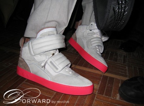
Kanye is working on a new line of sneakers in conjunction with Louis Vuitton and I've been following the releases on Sneaker News. These newest sneakers, which were leaked yesterday, feel more like the McFly 2015s than anything else that's come before.

I also have a strong suspicion these shoes were created at the same time as my favorite song from the new album, "Robocop". If I close my eyes, I can see Kanye wearing these shoes and a Tron helmet while eating a bowl of buttered popcorn and listening to "Robocop" at full volume. Love hurts and time (travel) heals all wounds.

This is Not the McFly 2015

Posted July 3, 2008

20080703hyperdunk.jpg

I'm sorry, the new Nike Hyperdunk is nice, but it ain't no McFly 2015. I appreciate the thought Nike, but either do it right or don't do it at all.

Favorites from the Cooper-Hewitt National Design Awards

Posted May 12, 2008

The winners were announced sometime in the last week or two (based on where these links lived in my tabs) and I tabbed through all of them for some creative inspiration. These were my favorites.

Sanlitun North by Lot-EK

20080512cooper1.jpg

This is a mixed-use building in Central Beijing by Lot-EK and designer Kengo Kuma. I'm a sucker for boxy with a twist.

Title Sequences by Prologue Films

20080512cooper2.jpg

The film stills above are from the title sequence of Kiss Kiss Bang Bang, a pretty good move with great titles. This team is also responsible for the great Spiderman 2 and 3 title sequences.

Magazine Design by Open

20080512cooper3.jpg

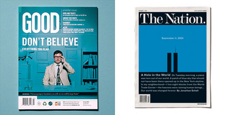
I've long been a fan of Good's design, especially the covers, and I was taken with what I saw of Scott Stowell's (he is the head of Open) work on The Nation.

What's the Problem?

Posted April 21, 2008

Wednesday of last week I went to see three partners from Pentagram — Paula Scher, Michael Bierut and Michael Gericke — present "Designing New York’s Visual Identity" at the Museum of the City of New York. Most of the pieces weren't new to me, but the discussion portion got my mind stirring.

One of the Michaels, I believe it was Bierut, mentioned his preference for redesigns over creating new branding. Responding to a question about how to deal with poorly received design, Scher explained that this is actually a failure in understanding the client's needs. Together, these points got me thinking about the anxiety that comes with new design projects.

I enjoy design work, but I often get frustrated when there isn't a clearly defined set of problems. Redesigns tend to be easier because the questions are clearer. Not only do you have an existing model for reference, but the client has a better sense of what's missing in the current setup.

The key to keeping frustrations at bay is defining as many questions and answers as possible before putting pen to paper. If you don't have all the questions, go back to the client. If you don't have all the answers, go to your coworkers or peers. It sounds simple, but it's something I rarely remember to do when I'm feeling stressed.

Britain's Beautiful New Coins

Posted April 8, 2008

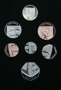
20080408coins.jpgI'm floored by Britain's new coinage, designed by Matthew Dent, a 26 year-old graphic design student. They're based on the British Royal Arms and all form a piece of the whole. For a little more explanation and some history, be sure to watch the video.

On the other hand, the MySpace-ification of U.S. money continues with the new five dollar bill. Technically impressive, completely uninspired and totally American.

Panic PIN for ATMs

Posted September 11, 2007

At 11pm last night I remembered my laundry was ready to be picked up from good ole Mr. Wash-n-Fold. Despite being cashless, I had to venture out since I'm leaving town and need some clothes. As I walked down the desolate streets of downtown Brooklyn, a crazy garbageman thought it would be funny to gun his engine at me while I crossed the street. I shook my head, he yelled obscenities and I walked away mildly paranoid that he was coming after me with a broken bottle and a tire iron.

Thankfully he wasn't, but as I took out more than my usual ATM bounty, I realized a panic PIN number would be terribly useful. If someone had followed me at bottle-point, I could have entered my bank's panic PIN. The ATM would then say it's out of cash and alert the police. Maybe, in a distant more connected future, it would stream the video from the ATM camera straight to the police station. Since this doesn't yet exist, I took solace in my spry legs and knowledge of convenient hiding spots.

Unsurprisingly, I'm not the the first think of this, but it's still a great idea.

A Font-astic Calendar

Posted August 15, 2007

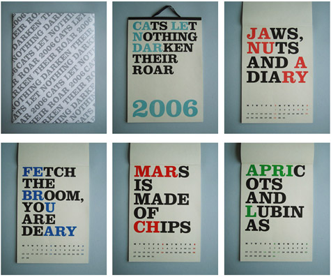
Noa Bembibre Calendar

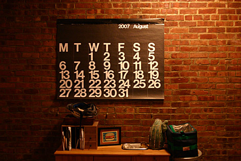
I saw this calendar on Swiss Miss and immediately wished I could buy it. I have a slight love of fonty calendars though, as my wall is currently adorned by the Stendig Calendar and I previously had the Pentagram Calendar, which was equally elegant. Hopefully Noa Bembibre will eventually let me add to my collection.

Stendig Calendar

An Easy-Open Plastic Case

Posted August 1, 2007

20070801easyplastic.jpg

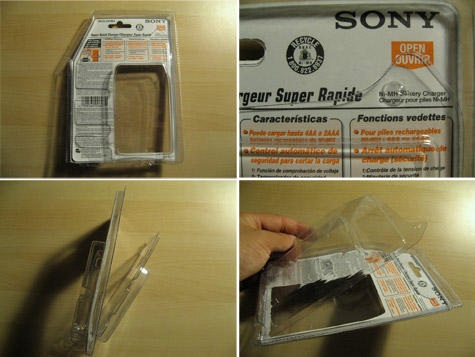
I'm sure you're like me in that you hate trying to crack into these things. They're impossible to open at best and lead to profuse bleeding at worst.

Sony got smart and made a perforated edge along the backside of the packaging and it made my day. Sony has dropped the ball on a lot of big things (e.g. PS3, MP3 players) but seems to do some small things right.

Click the image to see a big version on flickr.

How I Read the Approval Matrix

Posted July 19, 2007

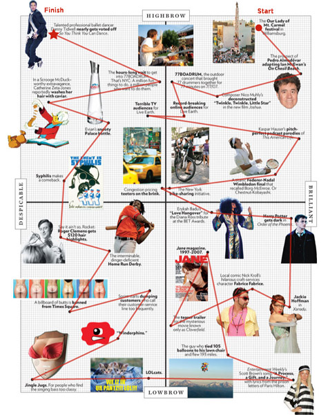
One of my favorite features of New York Magazine is the Approval Matrix. They place a bunch of items on a two-dimentional axis with Brilliant/Despicable on the x-axis and Lowbrow/Highbrow on the Y-axis. I've always wondered if everyone else reads it like I do. So, I thought I'd show you how I read it. Here is this week's matrix if you want to check it out yourself.

approval-matrix_475.jpg

The Erosion Sink

Posted March 27, 2007

20070327erosionsink.jpg

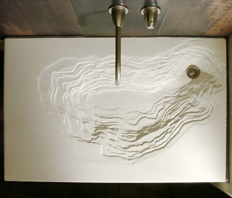
While looking at Organic Architect's 2007 Awards, I came across the Erosion Sink again and thought, "I'm glad I blogged about that a few months ago." Well, turns out I didn't. It may just be a sink and there is pretty good chance water would splatter when you use it, but this is a piece of art and you deserve to see it.

The sink is built by Gore Design and is made with eco-friendly materials. Unfortunately, all of the posts I could find are similar to mine (eco-friendly and fucking awesome!), but I'm quite curious about how this was created. Maybe this post will be the tipping point and HGTV will interview the designers for me. Get to it, people.

The Eco-Friendly 7.83Hz House

Posted March 22, 2007

20070323archicteture_1.jpgI often forget how much I enjoy architecture, efficient design and the conjuction of the two. Wired's recent section on green homes reminded me about how much exciting work is out there and got me jonesing for more.

Treehugger's post about a new British project called the 7.83hz House (named for the Schumann Resonance, which is the frequency of the earth's vibration) really stuck out as a fantastic idea. The architects, Simon Beames and Simon Dickens, realized it was possible to create a beautiful, eco-friendly home by using biodynamically grown wood products, going pre-fab and only using dowels instead of wood glue (a little nerve wracking but they seem trustworthy). As the original article from the April issue of Dwell explains, these glues usually give off formaldahyde, i.e. the substance that created this. As Beames says in the article, "[People] eat organic foods, but what are they sitting in?"

Being eco-friendly isn't enough though. My favorite feature is the modularity of the project. "The interior can be altered as families grow or shrink, with floors added to create new bedrooms and removed to create double-height living rooms or even a roof garden." The houses are also built to be grouped together for those want to stay close to friends or become an entrepreneur. While this is fantastically awesome, the best feature is the price: $170,000 without the cost of land. While land ain't cheap, this puts the 7.83Hz house within the grasps of those who aren't CEOs of technology companies or ex-Vice Presidents.

20070323archicteture_2.jpg

Rumor has it, Youmeheshe (the firm's name) is bringing the design stateside, so getting one of these in the near-future is a reality for one or two of my readers. If you want a closer look, the firm has posted more photos to flickr.

Two Sneakers: One You Can Buy, One You Can't

Posted March 5, 2007

20070305sneakers2.jpg

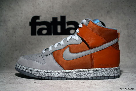
Orange Crackle Dunk Highs

These are new hi-top Dunks that were previewed by Fat Lace. They're supposed to come out this summer along with the slew of other shoes previewed on that page. I think the combination of colors and textures make this one pretty fantastic.

20070305sneakers1.jpg

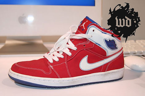
Custom Nike Air Jordan I

Oftentimes, a shoe is made as a sample or as an exclusive gift for someone. In this case, Hybebeast claims these were a gift made for an employee of UNDFTD (an exclusive sneaker chain). Too bad, as I really liked these and would be happy to grab a pair. (The original photo is courtesy of Weekly Drop.)

Advertising and Design in the (Pretend) Future

Posted March 2, 2007

When you make a film set in the future, you're forced to predict how society will differ. Two films that came out last year, Idiocracy and Children of Men, both provided their own perspectives.

Idiocracy

Idiocracy is set 500 years in the future and assumes everyone is unbelievably stupid. Speak Up provides screen-caps of ads from the movie that show off our faux progeny's brilliance. One thing they don't show is the disposable clothes that are covered in ads, a la Nascar.

Children of Men

Children of Men looks at a future where women are infertile and a class war is past its breaking point. These ads aren't as much of a stretch, but still are interesting.

(Side note: both movies are good, but I preferred Children of Men, even if Brawndo has electrolytes.)

Recent Entries