
9 pm → The Erosion Sink
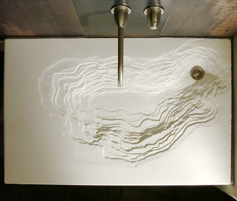
While looking at Organic Architect's 2007 Awards, I came across the Erosion Sink again and thought, "I'm glad I blogged about that a few months ago." Well, turns out I didn't. It may just be a sink and there is pretty good chance water would splatter when you use it, but this is a piece of art and you deserve to see it.
The sink is built by Gore Design and is made with eco-friendly materials. Unfortunately, all of the posts I could find are similar to mine (eco-friendly and fucking awesome!), but I'm quite curious about how this was created. Maybe this post will be the tipping point and HGTV will interview the designers for me. Get to it, people.
Posted in Design | Comments (4) | TB (0) |
11 pm → The Eco-Friendly 7.83Hz House
 I often forget how much I enjoy architecture, efficient design and the conjuction of the two. Wired's recent section on green homes reminded me about how much exciting work is out there and got me jonesing for more.
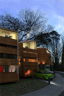
Treehugger's post about a new British project called the 7.83hz House (named for the Schumann Resonance, which is the frequency of the earth's vibration) really stuck out as a fantastic idea. The architects, Simon Beames and Simon Dickens, realized it was possible to create a beautiful, eco-friendly home by using biodynamically grown wood products, going pre-fab and only using dowels instead of wood glue (a little nerve wracking but they seem trustworthy). As the original article from the April issue of Dwell explains, these glues usually give off formaldahyde, i.e. the substance that created this. As Beames says in the article, "[People] eat organic foods, but what are they sitting in?"
Being eco-friendly isn't enough though. My favorite feature is the modularity of the project. "The interior can be altered as families grow or shrink, with floors added to create new bedrooms and removed to create double-height living rooms or even a roof garden." The houses are also built to be grouped together for those want to stay close to friends or become an entrepreneur. While this is fantastically awesome, the best feature is the price: $170,000 without the cost of land. While land ain't cheap, this puts the 7.83Hz house within the grasps of those who aren't CEOs of technology companies or ex-Vice Presidents.
Rumor has it, Youmeheshe (the firm's name) is bringing the design stateside, so getting one of these in the near-future is a reality for one or two of my readers. If you want a closer look, the firm has posted more photos to flickr.
Posted in Design | Comments (1) | TB (0) |
1 pm → Two Sneakers: One You Can Buy, One You Can't
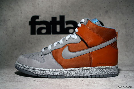
Orange Crackle Dunk Highs
These are new hi-top Dunks that were previewed by Fat Lace. They're supposed to come out this summer along with the slew of other shoes previewed on that page. I think the combination of colors and textures make this one pretty fantastic.
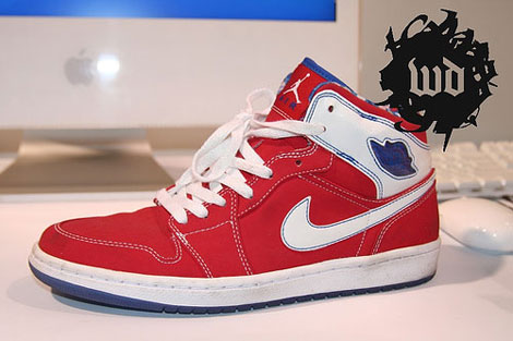
Custom Nike Air Jordan I
Oftentimes, a shoe is made as a sample or as an exclusive gift for someone. In this case, Hybebeast claims these were a gift made for an employee of UNDFTD (an exclusive sneaker chain). Too bad, as I really liked these and would be happy to grab a pair. (The original photo is courtesy of Weekly Drop.)
Posted in Design | Comments (0) | TB (0) |
8 am → Advertising and Design in the (Pretend) Future
When you make a film set in the future, you're forced to predict how society will differ. Two films that came out last year, Idiocracy and Children of Men, both provided their own perspectives.
Idiocracy
Idiocracy is set 500 years in the future and assumes everyone is unbelievably stupid. Speak Up provides screen-caps of ads from the movie that show off our faux progeny's brilliance. One thing they don't show is the disposable clothes that are covered in ads, a la Nascar.
Children of Men
Children of Men looks at a future where women are infertile and a class war is past its breaking point. These ads aren't as much of a stretch, but still are interesting.
(Side note: both movies are good, but I preferred Children of Men, even if Brawndo has electrolytes.)
Posted in Design && Music\TV\Film\Media | Comments (1) | TB (0) |
1 pm → USAToday.com Embraces Blog Design
 Jeff Jarvis got a heads up about the USAToday.com redesign (hat tip to Khoi) and I'm loving the way it looks. Rather, I'm loving the information architecture.
One of my favorite features of blog design is the ability to have a long scroll of articles on the front page, with interior pages using more categorization and hierarchy. As you can see to the right, USA Today's homepage has a long scroll of the most recent articles down the right side of the page. They also have incorporated a lot of other bloggy features (comments and tags, most notably), which is interesting but I'm skeptical about the quality of comments coming in (assuming they're not moderated).
While the NY Times is my preferred news source, the design is still based on the look and feel of a broadsheet. The amount of information and five main columns is just too much to digest for me. Clearly there is a lot of information that needs to be presented, but I don't think giving it to us all at once is the answer.
Jarvis touches on the subject in a more general way, saying, "In fact, since most visitors to most news sites I know don’t even go to the home page in a day, I think the next frontier of design will be about exploding home pages and sites in a looser network of distributed content." Exactly. Since there will inevitably be a homepage for every media company, don't make assumptions about what people want to see. Give us the biggest news in one area, and a stream of the most recent news and stories in the other.
More: USA Today's Announcement
Update (3/5/07): The new USAToday.com is live.
Posted in Design && Technology\Web | Comments (0) | TB (0) |
1 pm → Four Clocks for Heavy Sleepers
Jori would be happy to tell you that I am a very heavy sleeper. When I hear my alarm, if I hear my alarn, I typically hit snooze or turn it off in various states of semi-consciousness. The only way to make sure I am truly awake is to engage me in some way. In other words, my mind tunes out an alarm but if the cable guy knocks on my door at 8am I won't have any problem getting out of bed.
These four clocks force you to put your mind to work.
Clocky
 Clocky is kind. He gives you one snooze to wake up before he rolls off your nightstand. Then you'll be forced to crawl under your bed to turn him off. Thankfully, he's fairly rugged and can withstand drops of up to two feet. While by far the cutest, Clocky doesn't require much mental exertion, just nimble feet. Buy Clocky for $50.
Danger Bomb Clock
 Finally, I can realize my dream of being Jack Bauer. Each morning, you will hear a loud explosion and must choose the correct, randomly-selected wire to make the noise go away. Good idea kids, but only picking one wire is a little too easy. Though resetting it might be a pain, which means it might just work for me. You can buy Danger Bomb Clock on March 17th. (via Product Dose
Puzzle Alarm Clock
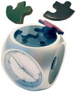 Finally, an alarm that gives you a challenge. Every morning, your alarm will begin to blare and four puzzle pieces will launch into the air. The alarm won't stop blaring until the pieces return to their original resting place. This one should wake me up, but I would have liked at least nine pieces. The Puzzle Alarm Clock is $59 at Bim Bam Banana, but out of stock until March.
Kuku Alarm Clock
 Like the puzzle clock, but more fun! When the work day is nigh, the Kuku Alarm Clock will begin crowing and will lay its eggs. The clucking won't stop until those eggs make it home. While I don't think I'd enjoy the clucking, this would certainly wake me up. I guarantee these eggs would be impossible to find. You can get the Kuku Clock for about $40 US at Latest Buy.
Bonus Idea
My friend Tien posted a picture just after waking up a few weeks ago. Immediately, I decided there needs to be a clock that takes your photo every time you hit snooze or turn it off. No, this wouldn't help you wake up but it would still be awesome. And if you're a clock maker and reading this, just combine this with the puzzle alarm clock, give it the ability to email photos (flickr!) and I'll buy two.
Posted in Design | Comments (5) | TB (0) |
12 pm → A Different Sony Ericsson Clamshell: W51S
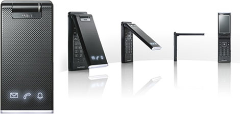
I'm a sucker for Sony phone design and this is no exception. It's an upcoming clamshell that has pretty typical features (2mp camera, big screen, blah, blah, blah) but I just love front panel. It's hard to tell if it's real or simulated, but the textured front with three LED lights is perfect for a clamshell. The only thing missing is a clock on the outside. It's simple, elegant and gets you the information you need. I'm excited to hear more about this phone. (via gizmodo)
Posted in Design && Technology\Web | Comments (0) | TB (0) |
12 am → Two Nifty Design Items
For a blog with the word "design", I don't really talk about it all that much. I'm hoping to change that some. Here are two cool things I happened upon this evening.
Media Skin Cell Phone
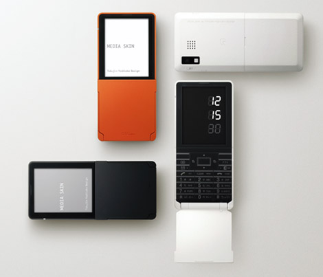
The Media Skin phone is apparently a pretty standard cell phone for the Japanese, but it looks pretty amazing. In my mind the plastic has some texture and give to it. This is pretty. [via Gizmodo]
Cam Firth Self-Portrait
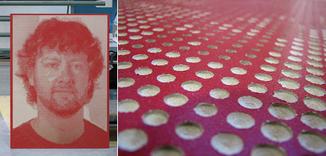
I found this on Moco Loco and I think I'll just quote them directly: "Designer Cam Frith at the University of Alberta's Industrial Design department recently created his "latest piece of self-gratification" with more than 14 000 holes of differing sizes drilled partway into a piece of red MDF. Cut using a CNC router, this fantastic self portrait fits nicely somewhere in that grey area between art and design." Head to the Moco Loco post for some more photos.
Posted in Design | Comments (0) | TB (0) |
1 pm → Ordering Streetcart Food and Usability
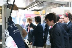 A month ago I went to Tony Dragonas' food cart to get a chicken gyro. While I knew that all of New York calls it a JAI-row, I insisted on calling it a YEE-ro, as I'd been taught that this was the correct pronunciation. When it was my turn I said, "One chicken yeero please." Before I could do anything about it I heard, "One chicken hero, coming up." Oops.
Today, I went for another one and my friend suggested I just call it a chicken pita. Hmm, good point. Then I realized that the word "gyro" is broken in the Mark Hurst This is Broken sense.
The most import aspect of ordering your food is properly conveying what you want. While I might impress a Greek man with a true pronounciation, saying "yeero with tzatziki" instead of "chicken pita with white sauce" will probably confuse the other 95% of servers. This seems especially true at a streetcart where speed and price are their two greatest assets.
Cultural heritage may be worth preserving, but not if I get my chicken on a hero instead of a pita. More broadly, it's often worth sacrificing something that benefits those in the know to help the general public. A parallel in web design would be the question of semantic mark up. In this case, <b> is to "yeero with tzatziki" as <strong> is to "chicken pita with white sauce". The first tag is more concise but could be confusing, while "strong" is more easily recognized by those who are new to HTML.
Really, how you order your food is a "know your audience" issue. Try ordering a hoagie outside of Pennsylvania and you'll see what I mean.
Posted in Design && Food | Comments (0) | TB (0) |
7 am → The Nike Dunk Low SBTG Makes Me Swoon
If you were to ever spend an unusual amount of money on a gift for me, this is it. These sneakers are going for about $360 + international shipping, but I've considered getting them several times. I may have a sickness, but these sneakers are beautiful. If you want to buy them for me or (gasp!) for yourself, you can find them at the kix-files shop.
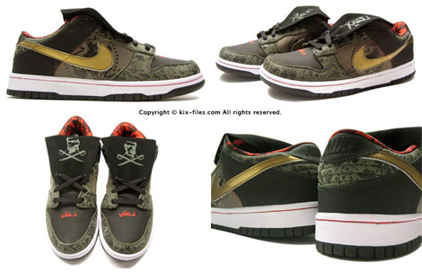
The full name of the shoe is the Nike Dunk Low Premium SB SBTG, with SBTG standing for Sabotage (a.k.a Mark Ong) of Royale Fam. Here's an interview with Mark from the latest Sneaker Freaker.
Posted in Art && Design | Comments (1) | TB (0) |
7 pm → My Jack Spade Bag
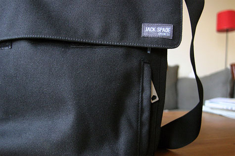
I believe everyone should buy themselves a good birthday present. You know yourself better than anyone else, so you should at least get one thing you're going to love. This year, I bought myself a Jack Spade bag. I've seen them around the subway and admired their simple, clean lines, but alway thought they were just a little too expensive/metrosexual. Then I saw one in the flesh (Jen got James one) and there was no turning back.
The bag is built beautifully and the attention to detail is exquisite. My favorite parts are the two outer pockets, which are clearly sized for an iPod and a set of keys (the larger pocket has an exit for your headphones), and the magazine slot in the back. I often find myself nearly missing my subway stop because I'm engrossed in an article and having to fumble with my bag to get the magazine inside, but this clears that up. As a bonus, one of the three small pockets on the inside fits my PSP perfectly (unfortunately my DS is a smidgen to large, which is why I'll obviously have to get a DS Lite).
Looking at the bag on the macro level, it's ideal for my commute to work. It can fit 2-3 magazines, all the items listed above and a lunch without much problem. Even better is that it easily fits in my lap, which was often a difficulty with my Chrome bag.
If you want to check out the details for yourself, I put together a flickr set with a few detail shots. I just wish more purveyors of goods took a ton of shots like this for each product, because the internet age is not great for kicking the tires.
Posted in Design && My Life | Comments (6) | TB (0) |
8 am → My First Counterfeit Bill
 Yesterday, I used my first redesigned ten dollar bill at Shake Shack. Of course, I didn't realize that until I felt it in my hands. Earlier in the week I was given one of the new tens by a coworker for a delivery order. My first reaction was, "Wow, they changed the texture a lot. Oh, and it's a bit smaller than regular bills. Wait a minute..." Althought my coworkers were skeptical, it was definitely a fake.
It also dawned on me that the introduction of the new ten was a perfect opportunity for counterfeiters. The ten dollar bill is a small denomination that is rarely checked by retailers and since it was newly redesigned people could be fooled long enough to let a bunch of them slide, just like I nearly did. Aside from the size and texture, the bill looked the part. If I was manning a cash register and it was slipped between a few other bills, I doubt I'd have noticed.
Also Interesting:You probably noticed the image of a ten above has the word "specimen" on it in bright red lettering. This is because Photoshop uses an anti-counterfeiting mechanism built at the behest of the U.S. government and international banks. If you try to open an image of a banknote, you are often sent to rulesforuse.org, but this may have changed as mine just printed "specimen" on the bill.
Posted in Design | Comments (5) | TB (0) |
12 am → ESPN Super Bowl Poll Results
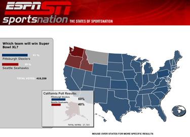
To no one's surprise, ESPN held a poll on the result of the Super Bowl. The people predicted Pittsburgh would win (and they were right). It also seems, as you can see above, that they broke the poll results down by state. This isn't an earth-shattering development in poll results, but I'd never seen it for sports. I like seeing where each state's affinity lies.
The hometown states picked their teams by large margins, as did the states that bordered them. Every other state picked Pittsburgh, which makes sense if you believe in the wisdom of crowds. Still, I liked seeing how far the ripple of support spread for each team. I imagine a team like the Cowboys would have much wider support than a nobody like the Steelers.
If you're interested in seeing more of these, ESPN has archived their polls for you.
In other news, the game was pretty much a bore aside from a few exciting plays. I shouldn't be shocked. I probably should have tivo'd the game and went to the un-superbowl party I was invited to by proxy. Next year I'll know better, unless the Bears are in it.
Posted in Design && Sports | Comments (0) | TB (0) |
1 pm → Sexy New Frank Gehry Watch
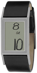 While in Asia, I happened upon this watch in a swanky watch in a swanky homegoods store and fell in love. I'm not a big watch-wearer, but this was unique. It wasn't until I did some googling that I found out it was designed by Frank Gehry and made by Fossil. Still, I didn't need a watch and it was 200 bucks there, so I passed.
Thankfully, I mentioned it to my lovely girlfriend because she surprised me with it for Chanukah this year. As you can see from the photo, instead of showing the boring "12:15 PM" it would say "15 past noon"; if it's 3:45, it reads "15 til 4"; and if it's 12:30am it reads "half past midnight". Also, during the day it has white writing on a black background while showing the opposite at night. For a digital watch, it's incredibly elegant.
Unfortunately, I couldn't find much information online about Gehry's inspiration or thoughts on the watch. All I could find was this boring press release. Too bad, as I'd love to hear this thoughts.
Related: The M & Co. watch I got a couple years ago
Update (1/28/06): Gizmodo and Boing Boing point to a similar but uglier watch. I'm much happier with mine.
Posted in Design | Comments (2) | |
11 am → JNF.org: A Big Redesign
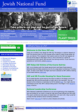 I don't talk much about work, but I just finished a redesign I'm proud of and I'd like to share. I was originally hired at Jewish National Fund as an intern responsible for making the site look less ugly. My boss didn't have an ounce of design skill, which showed in the original content of the site. I started cleaning things up slowly, but it was never perfect. Well, it still isn't but that's life. About six months ago I decided it was time to create a new framework; something that was significantly less cluttered.
The previous design was table-based and something of an eyesore. Since we use a hosted solution, I was a little nervous about doing the whole site in CSS as there was a good chance the application could break the design. I pushed on though, and managed to make it work. Surprisingly, we haven't had a single person complain since the switch-over.
My biggest challenge was trying to make the sucker-fish dropdowns work with flash. In the end, I never got it perfect, but it wasn't my fault. It works properly in every browser except for Safari (there's a bug) and IE for Mac (it sucks, so I served an image instead). This project made me realize how far we've come with CSS. It's not just that CSS can do everything tables could, it's that it can do so much more.
So, my first major redesign for someone who gets more than 50 hits a day is complete. It was nerve-racking, but a success. The next step is cleaning up the content for all the interior pages. Some of them are really a mess. Anywho, let me know what you think...click!
Posted in Design | Comments (1) | |
9 pm → New York Auto Show
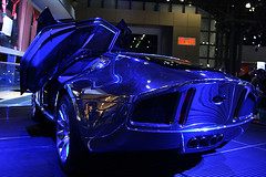 Last night I visited the New York Auto Show. It pales in comparison to the Chicago or Detroit shows, but it still had some swanky cars. The one pictured above, which was beautiful in person, is the Ford GT Tungsten.
For the most part, I like auto shows because I get to see cars I'll never get to drive. I'm not in the market for a car, so instead of shopping I take note of cars that just look great. The show in New York had enough of that, which made me happy. My favorite car that I could afford one day was the BMW 330i (pictured here). My favorite car I could never afford is the Carrera GT (pictured here).
Something that blew me away was the Maybach 62. I can see why it costs over $300k, but it is totally ridiculous. Who needs a printer built into their arm rest? 'Zactly. The photo I missed but wished I hadn't was a group of high school kids sitting in a Hummer H2 with huge smiles on their faces. I fear for their lives.
I have a few more pictures than the ones posted or linked to above and they're all on flickr.
Posted in Design | Comments (1) | |
1 pm → Madison Square Garden Seating Chart
I love checking where my seats are before I head to a game or concert. It's nice to know exactly where you're sitting. In the past, you used to be lucky if you could find a seating chart, let alone one that was easy to use. Madison Square Garden's seating chart is better than anything else I've seen.
When you first get to the page you need to choose the location of your event (MSG, Theater at MSG or Radio City Music Hall) and then click on the image to launch the flash app. Assuming you choose the MSG seating chart, you will see what is pictured in Figure 1.
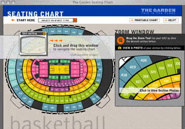
Fig. 1
If you would like to it's pretty easy. Figure 2 shows an example of the process of swithcing and how it changes.
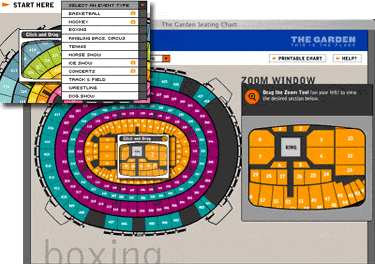
fig. 2
My favorite feature is the ability to zoom in on a specific section (fig. 3) and then if you click on the section number in the zoom area it brings up a photo of your perspective from that section (fig. 4). Brilliant.
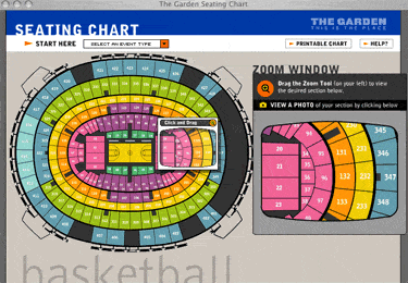
fig. 3
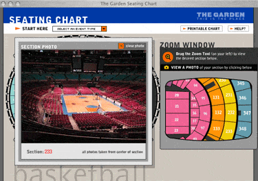
fig. 4
It's amazing how easy it is to make me happy as this is not a flashy, crazy implementation. It is just enough to get the job. Simplicity and ease of use at its finest.
Posted in Design | Comments (1) | |
12 pm → Mazda 3 5-Door
Man, I love this car It is beautiful. I'm also really liking the Mazda 6 5-Door. Mazda is definitely doing some of the best design today.

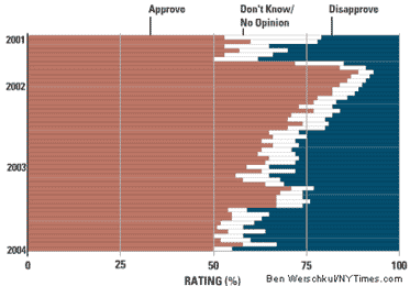
6 pm → Hey, Here are Some Infographics
The Race for the Nomination
This graphic is from the New York Times and shows the primary results. It appears that new information is automatically loaded each time you select a new section. My favorite graphics are the "Results by Candidate," and "Bush's Approval Rating" (pictured below).
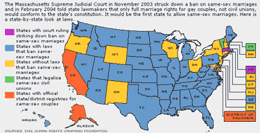
State-By-State Comparison on Same-Sex Marriages
This one comes from CNN and isn't all that graphically pleasing, but it is incredibly user-friendly. I looked at a similar graphic from CBS.com, which is much more difficult to understand, and realized the CNN one is quite effective. Below are graphics from a number of major news sources. You can decide which one is the best. (The graphics at their original size.)
CNN
CBS

MSNBC
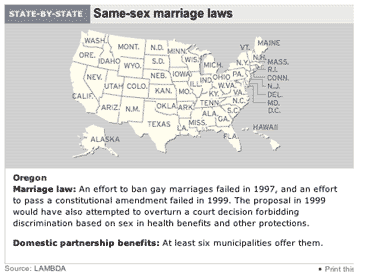
If you know of others, gimmie a holler via email (on the left).
Posted in Culture\Politics\Law && Design | |
2 pm → JeremyRound.com
The past couple months I have been helping my pal Jeremy get his music career going. The first step, and the one where I was the most helpful, was to build him a website. We did that and it's at jeremyround.com.
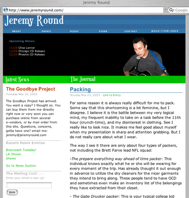
The whole site is managed with Movable Type so that Jeremy can update everything on his own without knowing too much HTML. The site uses Hiveware's Image Rotator to provide random images below the nav bar, which adds some fun to the mix. I think my favorite bit of everything is the use of an MT plugin called SomeDays, which lets me only show entries -- concerts in this case -- that take place in the future. Yes, I am aware my favorite bit is possibly the most nerdy one.
Of course the page (only the front one for the moment), validates in both CSS and XHTML. More importantly, Jeremy has really started to enjoy blogging his daily adventures as a San Franciscan musician. Welcome to the cult. Head over, check him out, and tell me what you think.
Posted in Design | |
2 pm → MLB.com Ticketing
A few weeks back I sung the praises of MLB.com's Gameday app. It is a wonderfully designed application that gives me everything I need. No major complaints. When I decided that I wanted to buy tickets for a Mets game through their website, I ran into problems. I should note that these problems had nothing to do with the look and the feel of the site, but with the general usability of the functionality.* In the spirit of 37 Signals' Design Not Found, I will dissect the problem.
I open up the window to purchase tickets and select the $14 Loge Reserved Back Rows and click submit. The name is horrible, but that's not the problem. I receive an error stating that I must select at least one ticket (fig. 1). I notice that there was a box to enter in the number of tickets and it is set to zero (fig. 2). It would make much more sense to set this to one and then allow people to change that number. Based on the next step I could understand starting with zero, but after I receive the error it should automatically be set to one (or even two, since this is most likely the most popular amount).

fig. 1

fig. 2
I enter in "2" and reselect the $14 option. At this point I am offered two different pairs of tickets. I like having options, but not these. The price level I selected was sold out (fig. 3), so they gave me two seats in either the $48 or $36 section (fig. 4). This seems to make absolutely no sense to me. It is one thing if these are the only remaining seats, but I tried again with the $9 price level and found two seats. If your price range is sold out, they should offer one level up and one level down because I'm not ready to spend an additional $34, especially since I'm a Cubs fan.

fig. 3
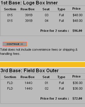
fig. 4
I haven't finished the entire process yet, but I will tell you what was good. Everything was easy to find as the layout was excellent. I especially liked the seating chart (fig. 5) as well as the two ticket options. For my $9 seats I was offered one pair of tickets near the first base line and one on the other side. This is an awesome feature. I also includedthe entire window so you can get the big picture (fig. 6).
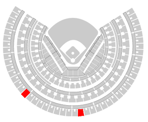
fig. 5
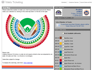
fig. 6
These two problems won't stop me from buying tickets online all together, but I will not hesitate to pick up my phone and call if I keep getting offered the best possible tickets when I ask for the second cheapest.
*I totally sound like Jesse Jackson there.
Posted in Design | |
9 pm → Customer Support Numbers
Earlier today I spent a little bit of time waiting to talk to a person at Time Warner Cable (I wanted to know if the digitial audio out on my cable box was actually functional). While on hold I thought about how we could improve the time spent on the phone.
One of the chapters in Faster by James Gleick discusses the ways of the technical help number. He talks about how the companies maximize their operators' time by installing these "sophisticated" phone systems. According to the book, "The software industry alone leaves Americans waiting on hold for an estimated three billion minutes a year." I don't expect this to change anytime soon, but they can at least make my time more enjoyable. Here is my customer support line wishlist:
- Tell us approximately how long we will be waiting. If it's going to be 10 minutes, I want to know.
- Do not tell us "thank you for your patience" every thirty seconds. Just let me tune out the music please.
- When the call starts let me punch in my extension immediately. I don't need to listen to whatever corporate branding and promotion you have to offer.
- Allow me to press zero or some other number to speak to an operator. Sometimes I don't know what department I need.
- If you ask for my account or phone number and it isn't in your records, please don't hang up on me. Tivo did this and it was very annoying.
- Give me a choice of music. Wouldn't it be great if you heard, "You have a 3 minute wait time. Press 1 to listen to jazz, 2 to listen classical, or 3 for the all Yanni channel." At least you'd have a choice.
Add your own wishes in the comments.
Posted in Design | |
6 pm → The New UPS
Two days ago, UPS unveiled a new logo. The last logo was designed in 1960 and is one of the best, most recognizable logos ever created. Here are the two logos, old and new, side by side.


Although the new one is infused with color, the font is crappy, the swoosh is a joke and the gradient just looks dumb. Although I think this is completely unnecessary, the UPS people clearly disagree.
"UPS is a vastly different company today than most people realize," said UPS Chairman and CEO Mike Eskew. "Today we are bringing our look up to speed with our capabilities."
Okay Mike. I still think that there was no need to spend $20 million (according to adweek) on a campaign that will not at all improve their branding. And while we're on that subject, I'd like to discuss this "brown" slogan. Megnut took a stab at it, and I'd like to say that when I think of brown, at least when the word is said outloud, I think of crap. So "What can Brown do for you?" does not have the meaning that they had anticipated. As Megnut said, it is very forced. No had referred to them as Brown; they are trying to force the nickname on us.
None of this will effect my usage of UPS, but I don't think it's going to help and it is definitely unnecessary.
Posted in Design | Comments (1) | |
3 pm → Font Hunt
Right now, I have a font shortage. There's a couple projects I'm working on and I just can't find the right font for the job. So where do you get your fonts? I want free and I want good. None of this crap that looks Matrix-y or is wrapped in bubbles.
Tell me your secret spots.
Posted in Design | |
8 pm → Element
I want one of these. The Honda Element definitely looks like it came straight from Tokyo 2010, but it really packs in a lot of awesome features. There are two design elements (he he) that really won me over.
1. There is an input jack for your digital music player. This means no more FM modulation or tape-to-iPod converters. This is definitely the wave of the future.
2. The way the seats fold up and completely out of the way is amazing. Head to the link above and check out some of the videos and you'll see what I mean. The car can hold 77.1 cu ft of cargo vs 54.3 cu ft on my Ford Escape and the Element is only a bit larger.
There are also a ton of other cool features and I think I'm going to have to give this car a test drive.
Another amazing thing is the Honda Studio E Concept that uses Mac OSX to run a really powerful car/entertainment center. My two favorite companies under one hood. Who'da thunk it.
Posted in Design | |
11 pm → Jenny Wins
It is official. I've been one-upped by JP. Man, nice job.
Oh, and at the stroke of midnight this site will come down for my own relaunch.
Posted in Design | |
8 pm → Mobile Home.
Mobile Home. In yesterday's NYT there was a section on home design. In the section there was an article called Mobile Home. It explains the loft apartment of Mike Latham and how all the furniture and some of the rooms are mobile.
This is what I've dreamt about for the last 10 years, since I saw a European home design magazine that showed a converted factory space that was built using the same principle. I really love the idea because it allows your living space to be so versatile. One day I'll be able to build my dream loft/house and it will be awesome. Totally.
Posted in Design | |
8 pm → Interface Design Overthrow.
Interface Design Overthrow. The fine folks at 37 Signals have taken the liberty of redesigning FedEx's online shipping form. They were frustrated with the process and decided to use it as an example of good design and their prowess, which is mighty. It's a well thought-out concept and worth a look for any would-be, could-be designers.
Posted in Design | |
6 pm → Flash is frustrating.
Flash is frustrating. Lately, I have been noticing that more mainstream sites are using Flash. The problem is, they aren't doing it very well.
People creating these sites have to realize that this is much more about information design than about a snappy graphic and some cool sounds. A good example of this problem is The Metro's site. They have a new "high bandwidth" version that assaults the senses with cool graphics and kickin' tunes. Your average punk kid will think, cool. Then they'll try and figure out who is playing, only to turn to the "tours" site and find they can't scroll down at a reasonable speed and can't scroll up at all. No good. If that isn't bad enough, there is a "nifty" sound effect everytime you click on the down button. No good. It is just atrocious. The kicker is the little ditty that continues playing throughout your visit. Unless the music is integral to the site, avoid it. You can leave me an option to turn the music on but don't make me listen to the crap you've chosen.
All I want is to find the information I need as quickly as possible. Is that too much to ask?
Don't get me wrong though, sound effects and information design in flash can be done well. The promotional site for the Nintendo Gamecube is a great example. It is fun and the noises aren't obtrusive. Another good example is French Kiss Records. When you click on one of the main links a man speaking french tells you where you're going. Well done. Also, the flash is used to create intuitive site organization, not a spectacle of sight and sound.
Remember, you have to seperate flash as an medium for art and as a business tool. There's more in me for this treatise but I'll end here. Maybe I'll write an essay of some sort. Hmm.
Posted in Design | |
1 am → Why am I at home?
Why am I at home? Oh yes, reloading for the rest of the night. The reason I'm posting is because I thought I would point you to my favorite little design bookshop. It's called Magma and is, unfortunately, only in London. Luckily, you can buy their books online. I won't lie to you though, shipping is expensive. Maybe I'll convince them to open up a store in Chicago. That would be amazing. That way it could be stocked with their books, shipping would be cheaper and life would be better. Maybe I'll just screw this whole web design thing and just open up a bookstore. I think that could really rule.
Posted in Design | |