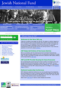
 I don't talk much about work, but I just finished a redesign I'm proud of and I'd like to share. I was originally hired at Jewish National Fund as an intern responsible for making the site look less ugly. My boss didn't have an ounce of design skill, which showed in the original content of the site. I started cleaning things up slowly, but it was never perfect. Well, it still isn't but that's life. About six months ago I decided it was time to create a new framework; something that was significantly less cluttered.
The previous design was table-based and something of an eyesore. Since we use a hosted solution, I was a little nervous about doing the whole site in CSS as there was a good chance the application could break the design. I pushed on though, and managed to make it work. Surprisingly, we haven't had a single person complain since the switch-over.
My biggest challenge was trying to make the sucker-fish dropdowns work with flash. In the end, I never got it perfect, but it wasn't my fault. It works properly in every browser except for Safari (there's a bug) and IE for Mac (it sucks, so I served an image instead). This project made me realize how far we've come with CSS. It's not just that CSS can do everything tables could, it's that it can do so much more.
So, my first major redesign for someone who gets more than 50 hits a day is complete. It was nerve-racking, but a success. The next step is cleaning up the content for all the interior pages. Some of them are really a mess. Anywho, let me know what you think...click!
09/21/05 12:29 PM
I like the design, it's very easy on the eyes. Notes:
1. Safari 2.01, the drop-downs at the top menu disappear when you start to select an item. You can move the mouse down and the drop item is still there, but it was startling.
2. Can you (try to) train users not use the phrase "click here" or "here" as hyperlinks? Example: Instead of "Emergency Relief Fund for Gaza Evacuees: _Click_here_ to provide housing and services for families in need." use "Emergency Relief Fund for Gaza Evacuees: _Provide_housing_ and services for families in need."
3. You can remove the http://www.jnf.org" from your links. That will save 1400 bytes per page load.
Good job. Now good luck with the rest of the site. :) Mike