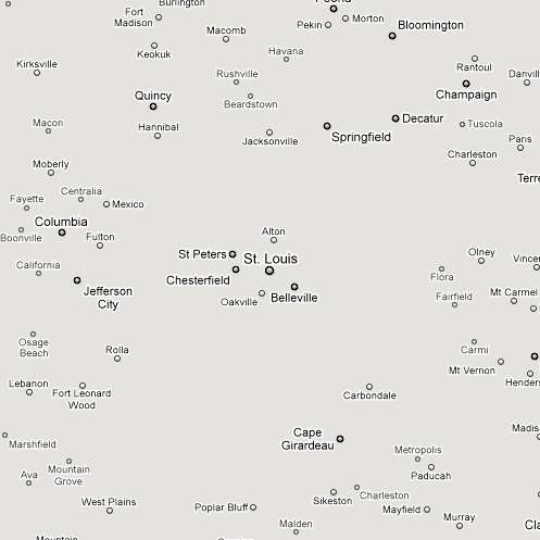
If you use maps regularly, it’s pretty obvious that Google Maps is far more legible than Bing or Yahoo, but Justin O’Beirne explains why. The three primary reasons are white outlines around text, more diversity amongst label sizes, and label shading. His breakdown is incredibly clear, but I love this extra point.
When you are looking at a big city, Google removes smaller cities outside of the metro area. Below, I’ve included one of Justin’s image where he used the Google Maps API to remove everything but the city labels. The results are striking.
[via Daring Fireball]